Would you love getting even better, richer and more vibrant colors from your NIR photos? Read on...
This blog is a bit longer, due to technical complexity. Hopefully it will explain clearly a technique useful for NIR photographers.
Long ago (from about 2004-2010) I had a website called surrealcolor.com which described filters and techniques for obtaining more diverse colors from NIR photography, when using a full spectrum or red-filter converted camera. I will offer techniques like those and more in this blog, starting with how to use an R66 or Red 25 type filter for getting vibrant colors. The plot below is a common way of describing the response of filters, of scene reflectance (i.e, from a leaf) and even the sensing response of a modified camera. The vertical axis shows the relative response level, in this case, the transmission of light through the filter, from 0 to 100% (1.0). The horizontal axis shows the wavelength or color. Most people are not familiar with wavelength numbers. The human eye can see blue (400nm), to green (500nm) to red (600nm), and begins to fade at longer wavelengths beyond 700nm. The plot below shows the response of the R66 filters in the red to near infrared (660-1000nm), and the Red 25 filters from about 600-1000nm.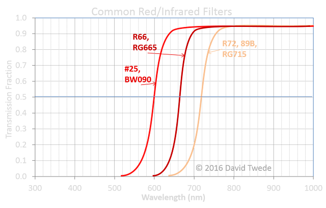

As I discussed in the "Reflecting on Plants" blog, most plant life exhibits very high reflectance in the deeper band (720-1000nm) and a very low reflectance in the more visible end (660-720nm). On the other hand, water, sky and many other scene elements have a flatter response across the red-NIR range. (See plot below).
 While understanding the reflectance of scene elements and the camera’s optical response to them is important, to take advantage of the color of infrared, it is important to understand how the camera calculates white balance and what it does to the coloring of converted camera using a red/NIR filter. When a camera records light that one cannot see with the unaided eye, it is electronically translating that light through the three color channels—red, green & blue—into colors on displays that we do see. How it translates, through color balancing, is important, much like translating from one language to another. A normal (unmodified) camera sees red, green and blue about the same way as the naked human eye. An infrared modified camera has responses in the red, green and blue to the near infrared and translates the near infrared colors to your monitor red/gree/blue display. Here is a plot of the near infrared camera color response (sensitivity).
The important take-away is that the red sensitivity to the infrared range is broader than the green/blue NIR sensitivity (which is almost at the same wavelengths as plant reflectivity), such that there can be color in the NIR between the channels, if care is taken when shooting a photo. Much of this is done through custom White Balance.
Some of us use the live histogram of our camera to get proper exposure. It is also very useful to understand the histogram in order to optimize and produce great infrared color images. Color is quite dependent on the white balance used. The camera generally computes a custom white balance (WB) by looking at the histograms of red, green & blue channel. A histogram is a tally of how many pixels are at each dark or bright level, as shown for the histogram of an unprocessed image shown below. Most of the scene pixels are in the medium gray area, which almost none in the darkest levels or few at the brightest.

To compute a WB the camera processor finds the max, min and median values from the entire scene in each channel and computes a color correction (rotation matrix) that will put the histogram of each channel so that the max data values are placed at the highest display value, and the lowest data values are placed at the lowest display values, with the mid point re-calculated based on a variety of statistics. This is shown in the histogram plots below from the same WB process in Photoshop. The before (left plot) shows that there are few if any pixels at the very darkest levels and very few in the brightest, with a sharp peak near the middle. After the WB (and contrast stretch) transformation (right plot), the histogram places many pixels at the darkest value and many at the brightest value, with a smoother mid level shape (with slightly altered mid point as well).


How you perform a custom WB in camera will make for different effects and improve the potential post process results. For example, the following scene--while not the most aesthetically pleasing but illustrative--was taken by custom white balancing off of a frame of just plants with exposure compensation of +1 stop. The plant life in the scene has very little color, while the pond water has a significant reddish tone.

The white balance can be taken off of the pond (or sky) to give a different effect, in which the plant life will have significant color relative to the pond water, as shown below (WB can be set in software when using a RAW file).
 We can examine the histograms of each red, green and blue channel to understand a little more about the scene. Below are shown the Red, Green and Blue channel images with corresponding histograms.
 The pond water is brightest in the red channel and darker in the green and blue channels (with pond pixels shown in the red circles of the blue/green histograms). The plant life is about equally bright in all three. This is a demonstration that the three channels have about the same light transmission in the near infrared range where plant life is most reflective.
So if they are equal, then why does plant life generally appear blue-green instead of white? The relative differences in the histograms, as used to compute white balance (color balance) show the reasons. When the red channel is stretched (the max/min pixels pushed to the brightest/darkest values), the pond pixel values are about the same as the plant life values. When the blue & green channels are stretched, the plant life pixel values are pushed high up the brightness scale, while the pond pixel values are pulled to the darkest scale. This contrast difference offers a relative brighter level for green & blue than for red in the plant life pixels, and a relative darker level for pond pixels for the same.
- Saturated colors in sky/water → then WB on plant life.
- Saturated colors in plants → then WB on sky.
A common practice in near infrared color photography processing is the "Channel Swap" method. I will not give a tutorial here, but you can find many by searching online. In summary, the red channel is swapped with the blue so that what is red in the camera data appears blue on the display, and what is blue in the camera data appears red on the display. It actually makes for more pleasing presentation of infrared images.


The above scene is the photo when custom WB of off the water, and then processed with channel swap and finally auto-levels (with auto color balance) in Photoshop. It gives dull water color, but saturated plant life. The plant color can be altered using the Hue slider in Photoshop (not described here at this time).
 There are other scene elements that can be used for white balance that may give different effects, such as colored cards, building structures (concrete, asphalt) clouds, etc. Experiment with WB and see what brings out different color tones and saturations in your imagery.
First comment! L.O.L. This post is over my head, however what I think what I'm understanding is that your NIR photos will have better quality. Am I correct?
ReplyDelete